
Visualize Data Smarter with GGplot2
Transform even the most complex datasets into clear, elegant, and impactful visualizations by harnessing the power of R combined with The Grammar of Graphics, enabling you to communicate insights effectively through professional, flexible, and highly customizable charts and graphs.
About GGplot2
GGplot2 is an open-source R package designed to make data visualization simple, flexible, and professional. Created by Hadley Wickham in 2005, GGplot2 is based on Leland Wilkinson’s Grammar of Graphics. This approach breaks visualizations into components—data, aesthetics, layers, and scales—allowing you to create consistent, reusable, and highly customizable graphics. Today, GGplot2 is one of the most popular R packages, trusted by data scientists, researchers, and analysts worldwide.
Key Principles
- Intuitive grammar-based syntax for easy learning.
- Highly customizable with themes and extensions.
- Integrates seamlessly with the tidyverse ecosystem.
- Produces beautiful, reproducible plots.
Key Features of GGplot2
Grammar of Graphics
Build complex plots by layering simple components like data, aesthetics, geoms, and themes using an intuitive syntax.
Customizable Aesthetics
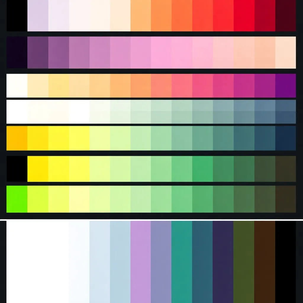
Fine-tune colors, shapes, sizes, and more to match your branding or emphasize insights in your data.
Publication Ready
Export high-quality charts in multiple formats for reports, presentations, and academic papers with ease.
Where Can GGplot2 Help You?
Data Science
Quickly explore large datasets, visualize correlations, and detect trends with ease. GGplot2 makes data-driven insights more accessible and visually clear for data scientists.
Research & Academia
Create high-quality, publication-ready figures that meet academic and journal standards. Researchers and educators rely on GGplot2 for its precision and clarity in scientific communication.
Business Analytics
Simplify dashboards, reports, and presentations with clean, professional visuals. GGplot2 helps businesses communicate insights effectively to stakeholders and decision-makers.
Education
Teach statistical concepts with simple, visually engaging graphs. GGplot2 makes it easy for students and learners to understand complex data relationships.
See GGplot2 in Action
From scatter plots to heatmaps, GGplot2 makes it easy to visualize any dataset. Explore these examples to see how it works in real-world applications.
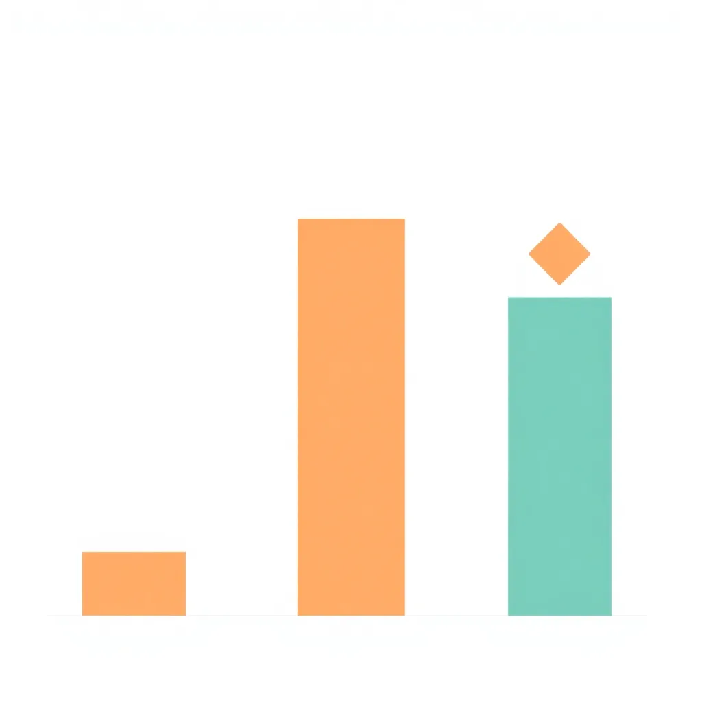
Build Visuals with Geoms
Geoms are the backbone of GGplot2. Each geom represents a type of chart, allowing you to build everything from simple scatter plots to complex multivariate graphics. By combining geoms, you can express diverse data relationships in a flexible and scalable way.
| Geom Type | Use Case | Syntax Example |
|---|---|---|
| geom_point() | Scatter plots, bubble charts | ggplot(data) + geom_point() |
| geom_line() | Time series, trend lines | ggplot(data) + geom_line() |
| geom_bar() | Count / frequency visualization | ggplot(data) + geom_bar() |
| geom_histogram() | Distribution estimation | ggplot(data) + geom_histogram() |
Start with GGplot2 in Minutes
Getting started is easy. Install the package, load it into R, and begin creating your first plot.
					install.packages("ggplot2")
library(ggplot2)

ggplot(data = mpg, aes(x = displ, y = hwy)) +
  geom_point()
Basic Scatter Plot
					library(ggplot2)
ggplot(mtcars, aes(x = wt, y = mpg)) +
geom_point(color = "blue", size = 3) +
geom_smooth(method = "lm", col = "red") +
theme_minimal() +
labs(title = "Car Weight vs. MPG",
x = "Weight (1000 lbs)",
y = "Miles Per Gallon")
Customized Bar Chart
					ggplot(diamonds, aes(x = cut, fill = color)) +
geom_bar(position = "dodge") +
scale_fill_viridis_d() +
theme_classic() +
labs(title = "Diamond Cut by Color",
x = "Cut Quality",
y = "Count") +
theme(axis.text.x = element_text(angle = 45, hjust = 1))
Ready to Transform Your Data?
Take your R skills to the next level and start creating professional data visualizations with GGplot2 today.
What Users Say About GGplot2
“GGplot2 completely changed how I visualize data. The simplicity and power of geoms make it my go-to tool for research graphics.”
— Dr. Ayesha Khan, Data Scientist
“From business dashboards to teaching, GGplot2 always delivers professional-quality visuals with minimal effort.”
— John Peterson, Analytics Consultant
“The community around GGplot2 is amazing. I learned more in weeks than I ever did with base R graphics.”
— Maria Lopez, Research Analyst
Frequently Asked Questions (FAQs) about GGplot2
install.packages("ggplot2") in R, then load with library(ggplot2).aes().facet_wrap() or facet_grid().theme_minimal() or create custom themes.plotly or ggiraph.ggsave() to save plots in formats like PNG, PDF, and SVG.